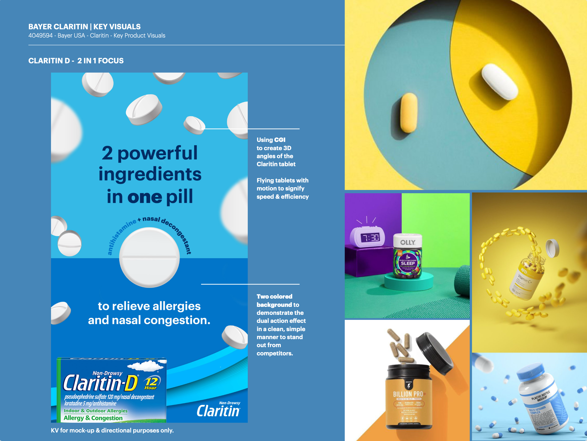
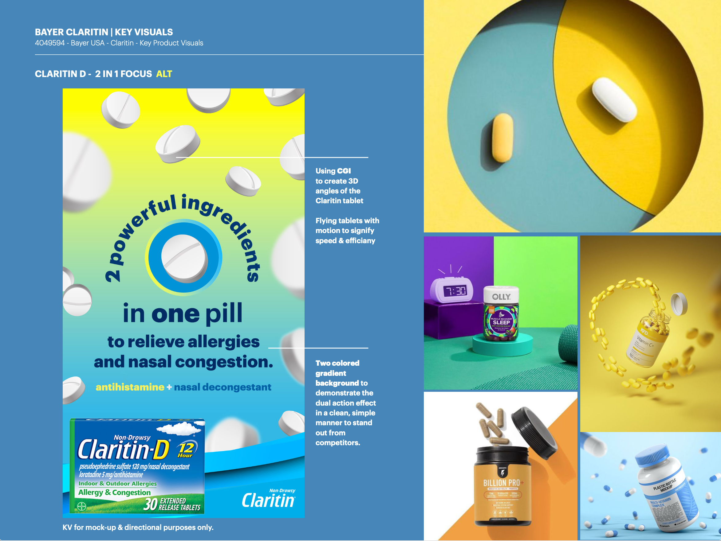
INSIGHT
In a crowded allergy category, visual consistency is key to building recognition and reinforcing product efficacy across multiple touchpoints.
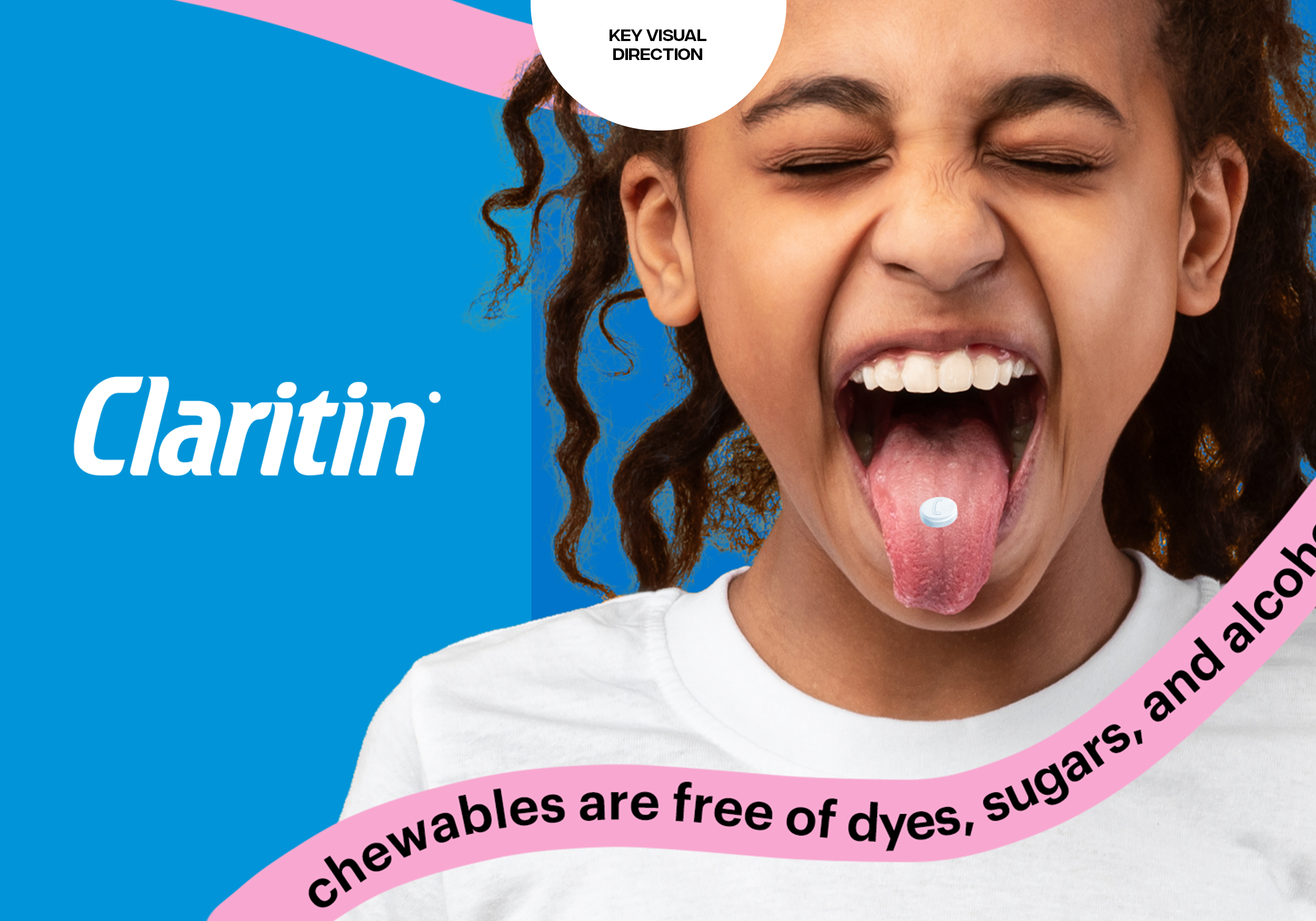
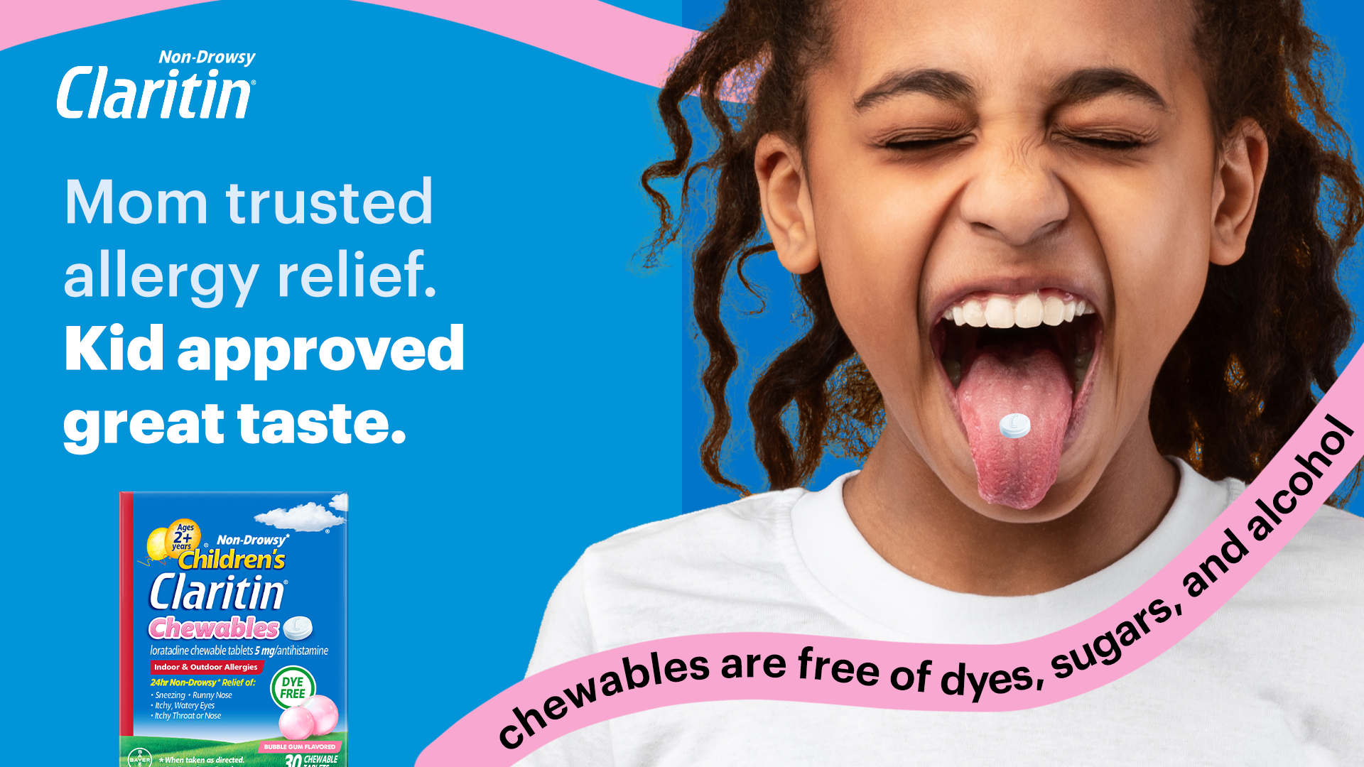
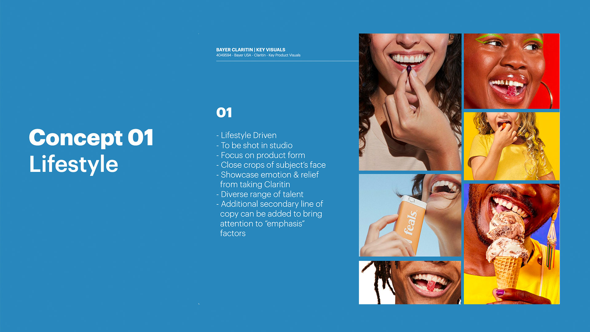
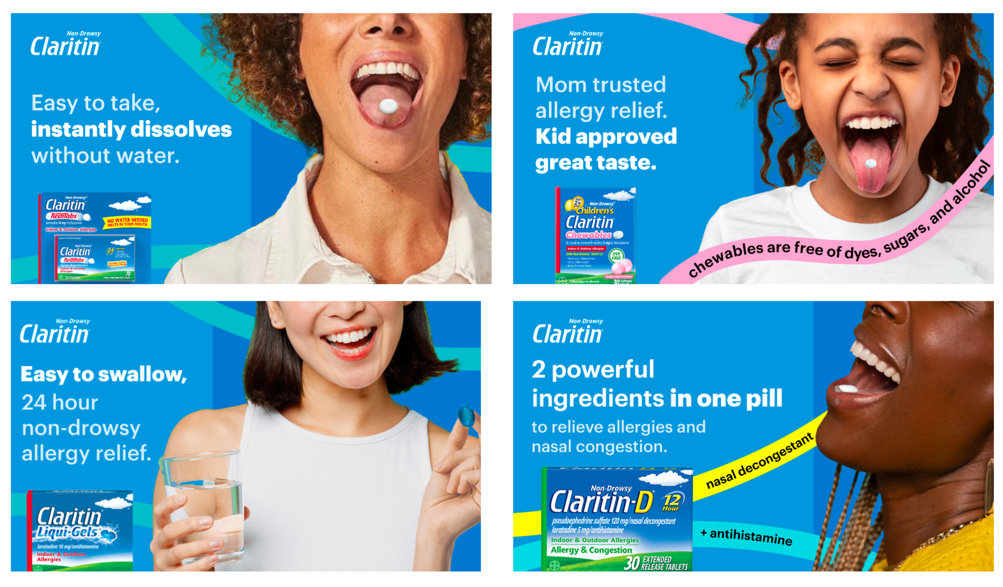
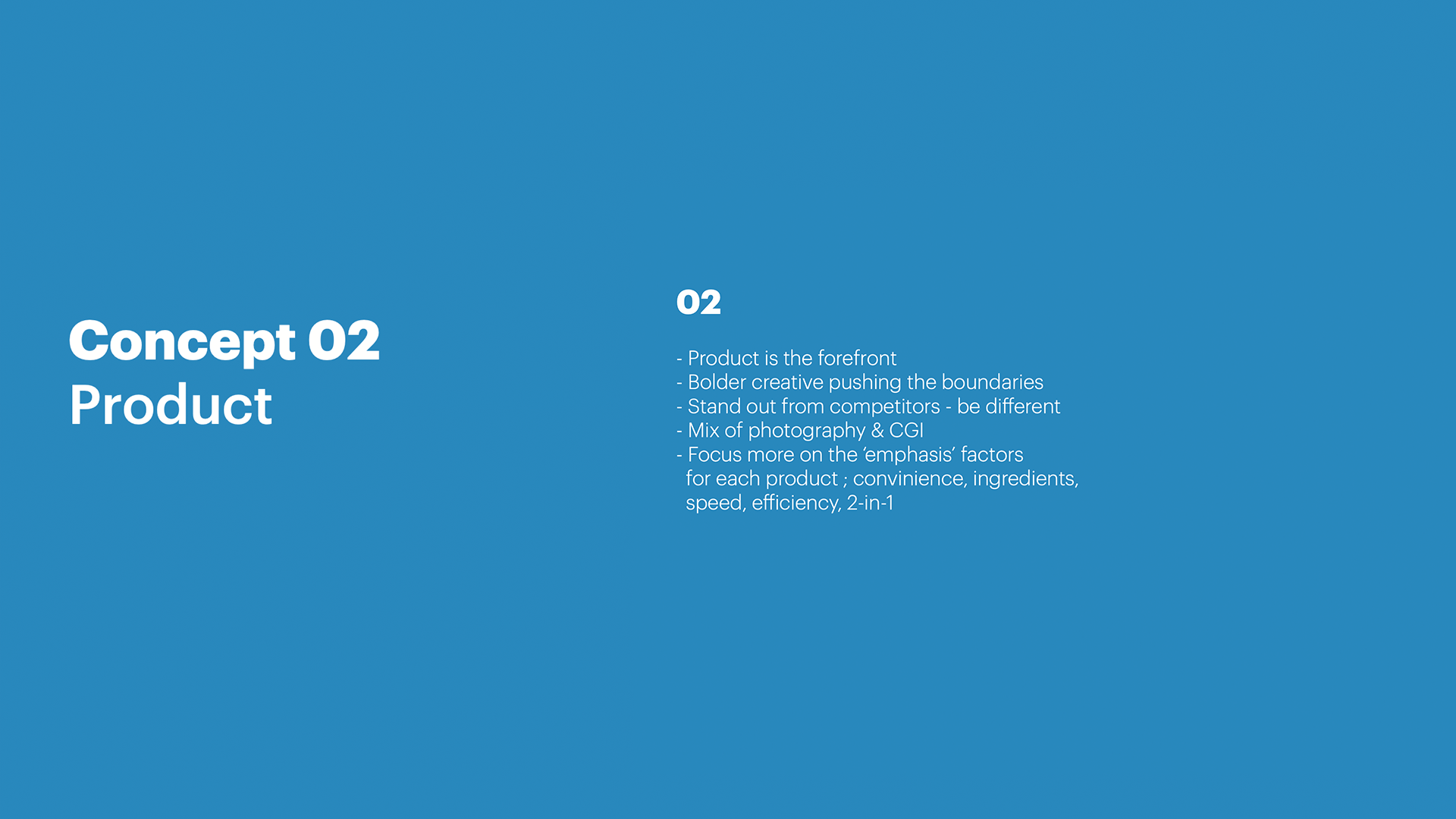
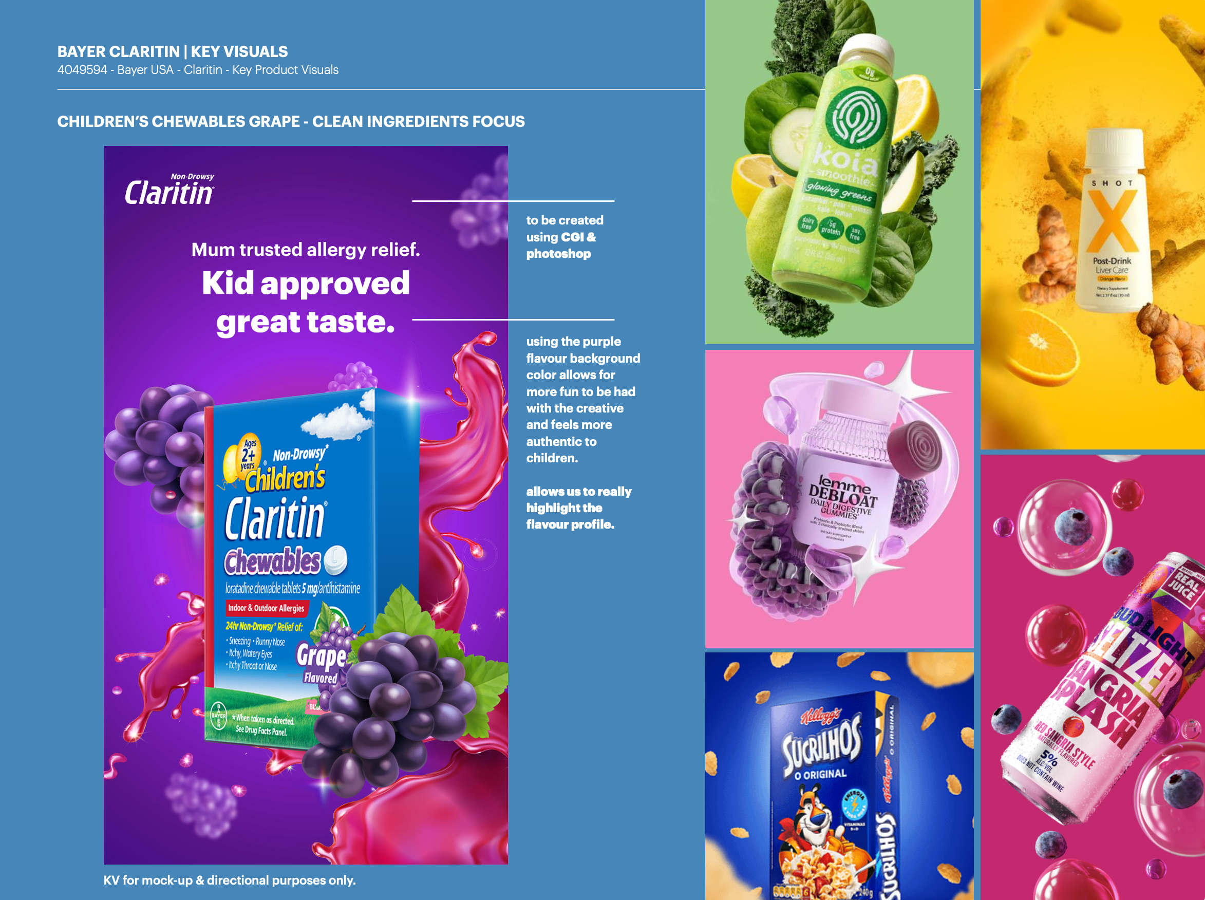
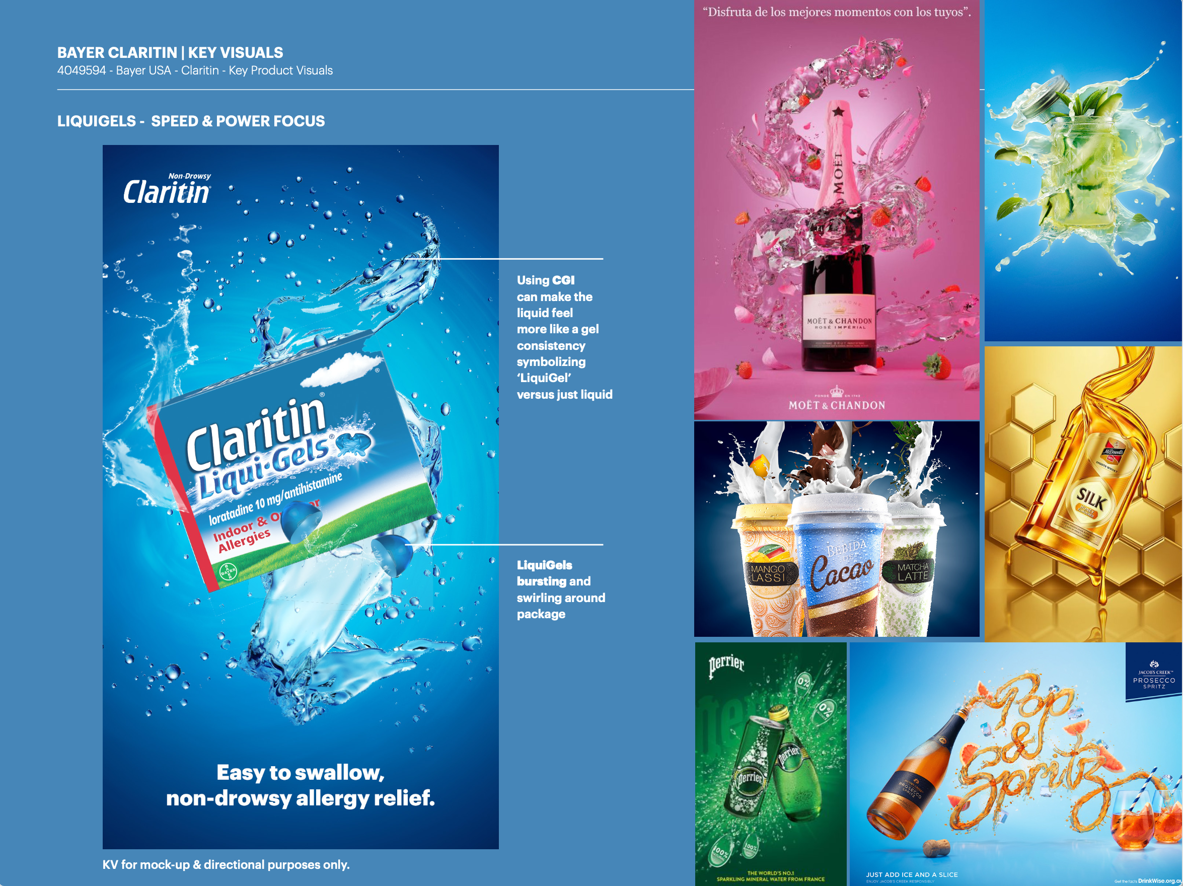
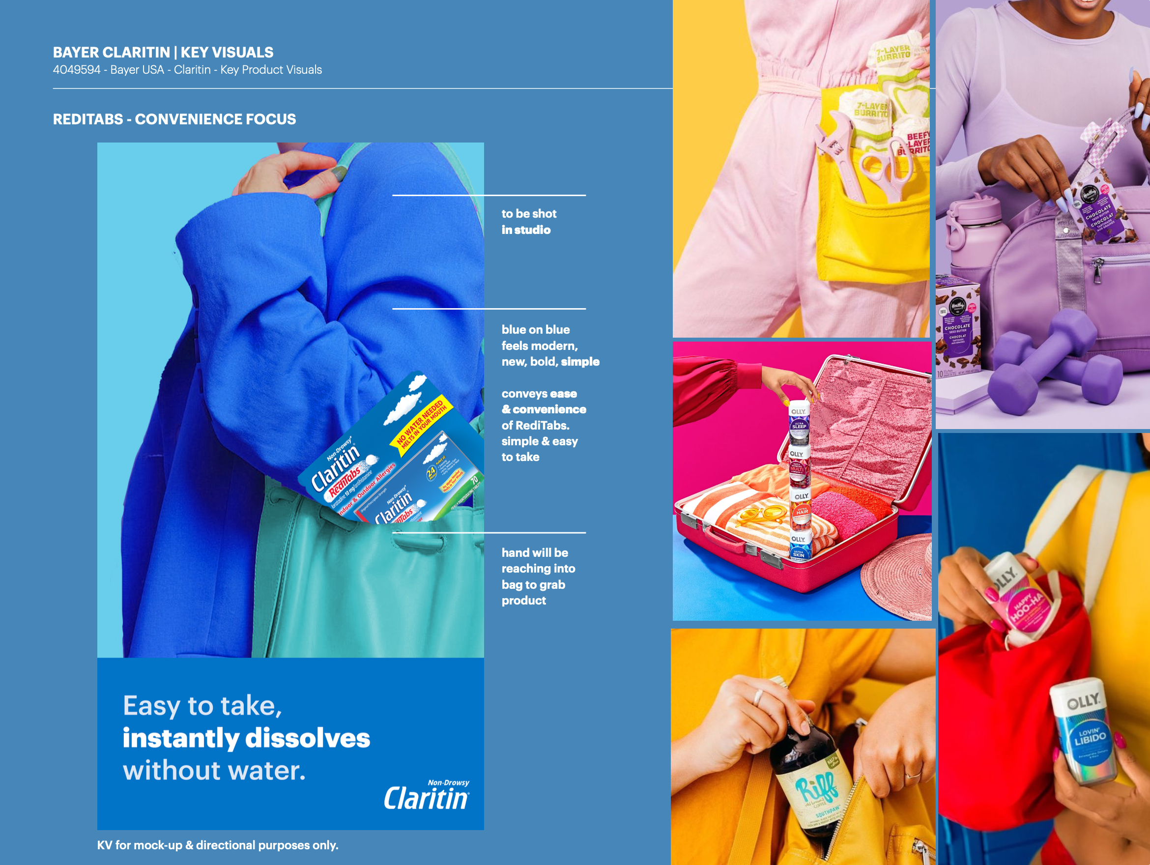
CONCEPT
Explored two distinct visual directions for Claritin’s campaign, each offering a different approach to how the brand could show up across key touchpoints.
One direction leaned into a clean, product-focused aesthetic to clearly communicate efficacy and clarity, while the other introduced a more expressive, lifestyle-driven approach to create a stronger emotional connection.
The exploration allowed for a strategic evaluation of tone, balance, and visual impact; helping define the most effective way to bring the campaign to life.